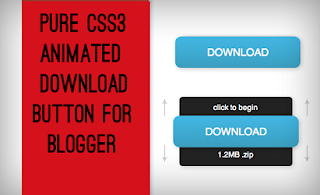
Pure CSS3 Animated Download Button for Blogger
Yesterday I was just randomly seeing some Pure CSS3 buttons and fortunately I saw a cool animated download button made by Designshac...
https://tipstricks4blogger.blogspot.com/2013/11/pure-css3-animated-download-button-for.html
Yesterday I was just randomly seeing some Pure CSS3 buttons and fortunately I saw a cool animated download button made by Designshack.net. As I scrolled down I saw many comments by blogger users that this button was not working so I checked it out and made certain changes so that this download button can work in blogger too. This button is made up of Pure CSS3 i.e. without the usage of any Images or JavaScript. This button may be really helpful for game/software download blogs. So a live working demo of this button can be seen by clicking the below button. You will see the button at the end of the post.
Live demo
unable to load
Once you have seen the demo, to add this animated download button to your blog posts follow the below steps -
Adding the CSS in the Template
Go to Blog Title → Template → Edit HTML and search for the code </body> and paste the below given code just above </body>.
<style>
.abt-button {
margin: 50px auto;
width: 200px;
}
/* Get this button at AllBloggerTricks.com */
.abt-button a {
background: -moz-linear-gradient(center top , #00B7EA 0%, #009EC3 100%) repeat scroll 0 0 transparent;
color: white;
display: block;
font: 17px/50px Helvetica,Verdana,sans-serif;
height: 50px;
text-align: center;
text-decoration: none;
text-transform: uppercase;
width: 200px;
position: relative;
z-index: 2;
/*TYPE*/
color: white;
font: 17px/50px Helvetica, Verdana, sans-serif;
text-decoration: none;
text-align: center;
text-transform: uppercase;
/*GRADIENT*/
background: #00b7ea; /* Old browsers */
background: -moz-linear-gradient(top, #00b7ea 0%, #009ec3 100%); /* FF3.6+ */
background: -webkit-gradient(linear, left top, left bottom, color-stop(0%,#00b7ea), color-stop(100%,#009ec3)); /* Chrome,Safari4+ */
background: -webkit-linear-gradient(top, #00b7ea 0%,#009ec3 100%); /* Chrome10+,Safari5.1+ */
background: -o-linear-gradient(top, #00b7ea 0%,#009ec3 100%); /* Opera 11.10+ */
background: -ms-linear-gradient(top, #00b7ea 0%,#009ec3 100%); /* IE10+ */
background: linear-gradient(top, #00b7ea 0%,#009ec3 100%); /* W3C */
filter: progid:DXImageTransform.Microsoft.gradient( startColorstr='#00b7ea', endColorstr='#009ec3',GradientType=0 ); /* IE6-9 */
}
.abt-button a, .abt-button p {
-webkit-border-radius: 10px;
-moz-border-radius: 10px;
border-radius: 10px;
-webkit-box-shadow: 2px 2px 8px rgba(0,0,0,0.2);
-moz-box-shadow: 2px 2px 8px rgba(0,0,0,0.2);
box-shadow: 2px 2px 8px rgba(0,0,0,0.2);
}
.abt-button p {
background: #222222;
color: #FFFFFF;
display: block;
font: 12px/45px Helvetica,Verdana,sans-serif;
height: 40px;
margin: -40px 0 0 10px;
position: absolute;
text-align: center;
transition: margin 0.5s ease 0s;
width: 180px;
z-index: 1;
/*TRANSITION*/
-webkit-transition: margin 0.5s ease;
-moz-transition: margin 0.5s ease;
-o-transition: margin 0.5s ease;
-ms-transition: margin 0.5s ease;
transition: margin 0.5s ease;
}
.abt-button:hover .up {
margin: -5px 0 0 10px !important;
}
.abt-button:hover .down {
line-height: 35px !important;
margin: -85px 0 0 10px !important;
}
.abt-button a:active {
background: #00b7ea; /* Old browsers */
background: -moz-linear-gradient(top, #00b7ea 36%, #009ec3 100%); /* FF3.6+ */
background: -webkit-gradient(linear, left top, left bottom, color-stop(36%,#00b7ea), color-stop(100%,#009ec3)); /* Chrome,Safari4+ */
background: -webkit-linear-gradient(top, #00b7ea 36%,#009ec3 100%); /* Chrome10+,Safari5.1+ */
background: -o-linear-gradient(top, #00b7ea 36%,#009ec3 100%); /* Opera 11.10+ */
background: -ms-linear-gradient(top, #00b7ea 36%,#009ec3 100%); /* IE10+ */
background: linear-gradient(top, #00b7ea 36%,#009ec3 100%); /* W3C */
filter: progid:DXImageTransform.Microsoft.gradient( startColorstr='#00b7ea', endColorstr='#009ec3',GradientType=0 ); /* IE6-9 */
}
.abt-button:active .up {
margin: -20px 0 0 10px !important;
}
.abt-button:active .down {
margin: -70px 0 0 10px !important;
}
</style>
After adding the code save the template and follow the next step.
Adding the Button
So as we have added the CSS we just need to add the HTML in the desired place. So whenever you want to add this button to your post just switch the post editor to HTML from Compose and add the below HTML.
<div class="abt-button">
<a href="#">Download</a>
<p class="up">click to begin</p>
<p class="down">1.2MB .zip</p>
</div>
After adding the HTML change # with the URL of the file to be downloaded. Change 1.2MB .zip with the files size and extension.
You are done now. Now you and your visitors can see this awesome Pure CSS3 animated download button in your blog.


